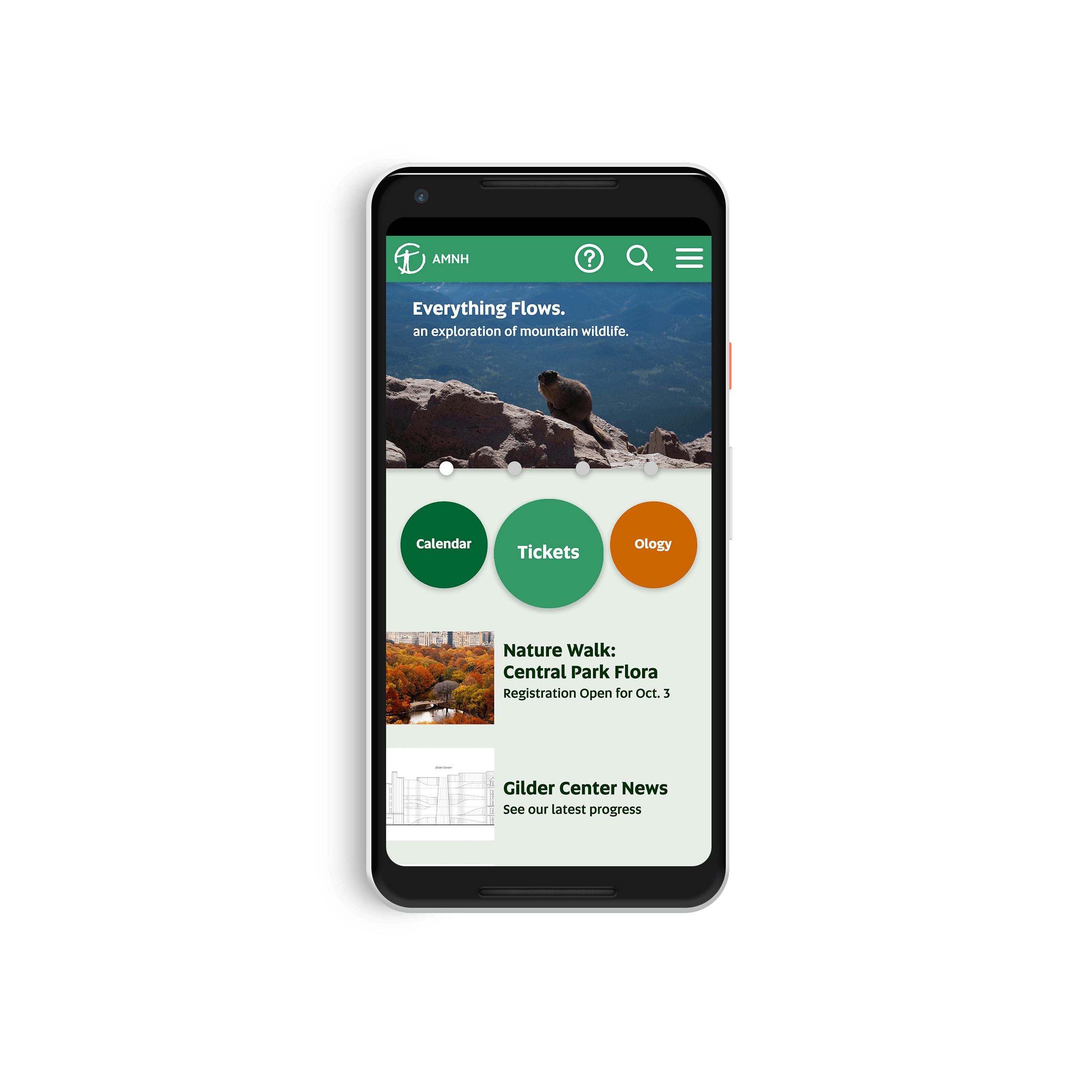
American Museum of Natural History site
Redesign a mobile website of my choice.
For the AMNH website, I focused on navigation. My process involved mapping the site’s information and condensing it into understandable user flows. Since the museum emphasizes the natural world, I incorporated organic colors and shapes into the user interface. The website consistently utilizes circles and shades of green.


